Ace Yonder
Well-Known Member
I love how, even thought I repeatedly have said that I think that there need to be MORE dimensions to the graph, and that even two axes is inadequate, you still think, because I posted ONE picture (even though I have posted about 5 multi-axis graphs from ontheissues which I feel are much more accurate as well) that i am somehow advocating for a single line graph. Do you really have that much trouble understanding what I am saying? And yes, they ARE redefining things, they are NOT using a Nolan graph, because THIS is a Nolan graph.I don't really care what they say, they did not invent the Nolan chart. No terms were redefined. Leftwing and Rightwing refer to socioeconomic status and thought.
Your belief that a line from conservative to liberal can encompass all social positions is atrocious.

Note the distinct lack of the words "Left" and "Right", and the lack of correlating them to a single axes. Notice how Progressive and Conservative, Libertarian and Authoritarian are QUADRANTS, not the axes. The (unlabeled) axes measure Economic and Social policies.
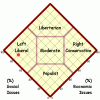
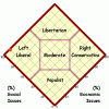
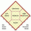
This is the graph that Ontheissues uses, which is almost identical to the Nolan graph, which I have posted much more of, and fitting the candidates accurately on Nolan-type graphs looks like this (Again, notice how the axes are defined as Social and Economic, and Left, Right, Libertarian, and Populist are quadrants, because they are not binary concepts):
Clinton:

Sanders:

Trump:

And another alternative, not exactly a Nolan graph, this is actually very similar to the Political Compass but with the nomenclature corrected.


