I havent seen you attempt to prove its accuracy, either. I have the URL already,feel free to keep posting it though.
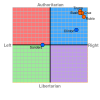
Its not the nationality of the creators of that graph that sway the assessments, it is their political leanings. I say that because if the majority of politicians and countries are clustered in the right/far right upper quadrant then I would say that they are looking at things from a left perspective. If the whole western world exists in a far right authoritarian political system what would be some examples of countries (past or present times) that existed in the lower left quadrant? They claim to judge things on a fixed political center but I think they weigh some things more heavily than others which explains the wide gaps in between some candidates and slight distances between others.
Maybe it's the whole world that's gone right wing, in response to the First World and American aggression?
Do you realize that America's standing military is larger than the next full dozen largest militaries on Earth... COMBINED?!
ANYONE would feel threatened enough to be militaristic themselves.
Besides, have you been paying attention to what the EU did to Greece last year? If that isn't economic warfare against an ally, please show me what is? How is what they did NOT right wing, neoliberal authoritarianism at work? I'd say the graph is pretty accurate, considering.
The graph isn't flawed, Sir- it's your perspective that's badly skewed. Not even your fault; American politics and our mass media that's the mouthpiece of corporate fascism is a hard smokescreen to see thru.